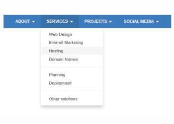

This menu uses the Bootstrap scripts ‘collapse.js’ and ‘dropdown.js’ scripts to implement a multi-level, responsive menu optimized for desktop computers and mobile (touch) devices. On desktop computer the menu will display a standard drop down menu and on mobile devices it will display a multi-level stacked menu with the familiar hamburger icon. The breakpoint is user definable.
| Created by: | Pablo Software Solutions |
| Added: | August 21, 2015 |
| Last update: | February 17, 2020 |
| Version: | 1.2.0.0 |
| Category: | Navigation |
| Designed for: | WYSIWYG Web Builder 10 (and up) |
| Downloads: | 13867 |
| 64bit support: | Yes |