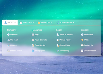

A responsive navigation bar with multi-column drop down menu with support for custom images, optimized for desktop computers and mobile (touch) devices. On desktop computer, the menu will display a drop down menu with multiple columns and on mobile devices it will display a multi-level stacked menu with the familiar ‘hamburger’ icon inspired by the design and behavior of the Bootstrap 5 navbar widget.
| Created by: | Pablo Software Solutions |
| Added: | July 11, 2025 |
| Last update: | July 11, 2025 |
| Version: | 1.0.0.0 |
| Category: | Navigation |
| Designed for: | WYSIWYG Web Builder 16 (and up) |
| Downloads: | 43 |
| 64bit support: | Yes |